The Nets are moving. No, not waving in the wind–the NBA team formerly known as the New Jersey Nets have a new home. And with the move to Brooklyn they are getting a new brand.
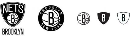
Unveiled on April 30, the new brand is inspired by 1950’s style New York subway signage. The brand colors are black and white, which aids in the classic feel. The primary logo kept to its predecessor by using the same shield shape and basketball with the iconic Brooklyn ‘B’ imposed over it. The throwback, retro brand was supposedly ‘designed’ by minority owner Shawn Carter (a.k.a. Jay-Z). But how much involvement he actually had in the process is unknown.
The new look is said to be different than other teams’ looks, just as Brooklyn is different than anywhere in the world, says team CEO Brett Yormark. He also says they will be the only NBA team with only black and white as colors and describes the new look as simple, crisp, classic and urban.
I agree that the classic look and colors will differentiate itself from the rest of NBA teams. It is refreshing to see a sports team go away from the pack of swoosh-whiz-bang visuals to a place uncharted for decades by using simple, non-obtrusive branding. It’s a nicely designed opposite-thinking type of design; one that looks like it is having a positive effect on sales, as NBAStore.com reported that sales of apparel on the unveiling day alone were higher than it sold all of last season.
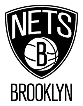 I applaud the original look and intent to differentiate. I enjoy the visuals from a distance–not overdone and perfectly simplified. But does it have what it takes to be timeless and sophisticated? Looking closer at the primary logo, it seems to have some odd tendencies. The text NETS feels steamrolled and thrown on (the S looks as if it has been steamrolled twice in opposite directions). The space to the top left of the N and to the to right of the S is very strange–the whole word would feel crisper had it followed the shape of the outer shield. The basketball lines, although accurate, would fit better with the iconic look if the line weight was the same throughout. With the addition of BROOKLYN placed under the shield, it makes the whole logo feel like it is going to tip over due to the relationship between the shield and BROOKLYN text being disproportional. Decreasing the size of the shield would benefit the look.
Although most of the elements in the primary logo don’t have the cohesive quality that an NBA team deserves, I still rather enjoy it. I like it for the fact that it doesn’t look corny, cheesy or multi-shadowed. It could use some fine-tuning, but the overall feeling of the retro throwback brand makes me feel like they know where they came from. I give it a B for effort (and Brooklyn).
Will the required footwear will be black and white Chuck Taylors?
By: Justin Leatherman, Art Director