Earlier this year, Kansas City unveiled a new logo and tagline in order to change the so-called “cowtown” perception of the city. In an attempt to make the city look young, hip and more urban to visitors, Barkley Evergreen & Partners developed a colorful and playful mark for the city, in which a continuous line forming the city skyline appears within three color blocks. The tagline, “New Discoveries Daily” appears below an elegant serif type treatment.
Over the past few months the new “brand” has been put into circulation, appearing everywhere from banners on downtown streets to the visitkc.com web site. The question that remains to be asked is: is the new brand effectively communicating the essence of the city, and was there ever a “cowtown” perception associated with it?

In comparison, the new Kansas City logo is neither original nor unique. The lop-sided, brightly colored boxes are reminiscent of 50’s and 60’s retro design, and because of that nostalgia, the mark becomes very trendy. The color scheme, while popular today, will more than likely be outdated in the next few years, as color preferences constantly change. Moreover, the skyline graphic, which to locals is representative of Kansas City, is too abstract to most people from other parts of the country, as it could be perceived as the skyline from any city in the nation.
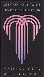
Only time will tell if the new look for Kansas City will become identified with the city as its creators hope. In the opinion of this author and critic, however, there was nothing wrong with the old mark or the city’s image. The”City of Fountains, Heart of the Nation” logo is a much more appropriate image for the city.
By: Ryan Hembree


