In recent years there has been a growing trend among well-established, large corporations to update their logos or brands. Sometimes this change is justifiable—for example, when merging with another company a changed logo must reflect the qualities of both companies. Most of the time, however, the reasons for an update are asinine.
Perhaps a new CEO has been brought on board, and in order to justify both their ego and high salary, their first order of business is to implement a massive, company wide change. Or perhaps it is thought that a new image will bring a failing company or brand back to life. If a company’s core focus of business has changed logo updates are thought to communicate that it is more progressive or cutting edge than before.

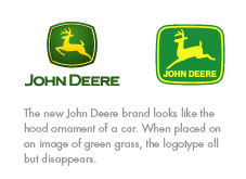
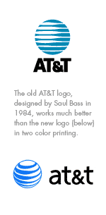
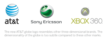
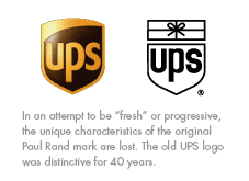
The current trend in branding and identity has been to add dimensionality, shininess and reflective qualities to a brand mark or logo. Even brands that had remained unchanged for decades feel prey to the lure of updating—first John Deere introduced their new badge, followed by UPS. The latest and most upsetting victim is the new AT & T mark. Like so many other marks, it has become a three dimensional globe with a generic typeface.

NOTE: All names, logos and trademarks used are the property of their respective companies and used for illustrative purposes only.
By: Ryan Hembree


