Flipping through WOOD Magazine, a simple column ad layout caught my eye. The ad said “TUB O’ TOUGH” and the full background was yellow. The main visual was a large cylinder ‘TUB’ of towels. I thought to myself, “well, that’s cheesy.” But because of the ad’s simplicity and undertones of a construction feel, I was intrigued to find out more.
 With a quick search I found out that these are heavy-duty wipes and have a pretty hefty claim—taking off anything from adhesives to lipstick, tree sap to permanent marker. The website gloats a bigger (10 inches by 12 inches), tougher (muscle-weaved) and soaked with a knock-your-socks-off cleaning solution. I guess these aren’t for cleaning your kids’ diaper messes. If I heard these claims and saw the previous package design, I might have laughed. But with the new design, it makes me think these are all plausible.
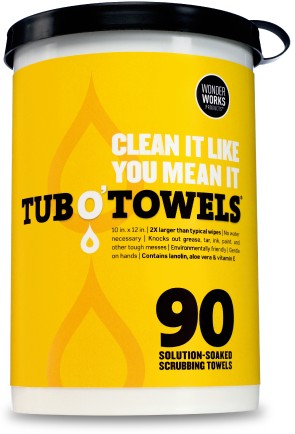
The new package is bold, bright, and eye-catching in a simplified way. The logotype uses a thick slab serif font which gives it a heavy-duty feel. The typography is large and in your face, and some dimensionality is portrayed with two large liquid drops in the background. The use of yellow is an interesting color choice—it makes me think of a dingy stain, but paired with black it helps the brand exude a ‘get-it-done’ feeling. It makes me want to puff up my chest and boast about using a wipe (for a greasy stain of course), even though the brand’s advertising says, “Don’t call ’em wipes, wipes are for wimpy jobs.”
The aesthetics of the package make the brand claims believable, while the use of clever slogans and advertising makes me want to try them. Whatever I’ll be cleaning, I’ll be sure not to call them a wipe.
—Justin Leatherman, Art Director